SPRUCE AVE, vancouver
RENOVATION | TOWNHOUSE | VANCOUVER
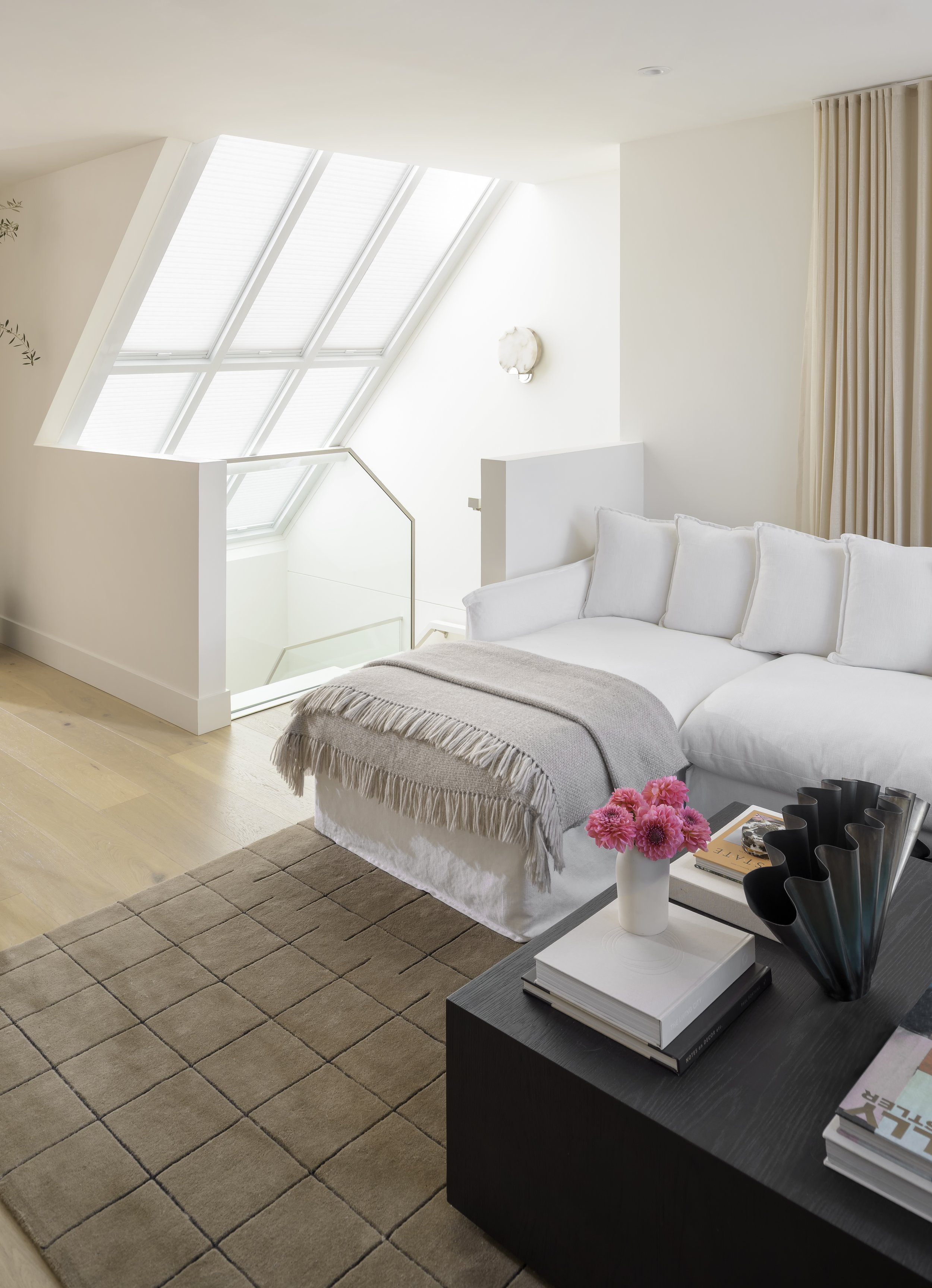
A modern-Nordic townhouse with a gorgeous view of downtown Vancouver was in desperate need of a floorplan reconfiguration. The space across all three floors was inefficient and too blocked off, which not only interrupted the spaces but inhibited the abundance of natural light. To draw in more light and open the tight staircases up, the drywall railings were replaced with glass and the skylights became more of a feature to draw in focal light across all three floors. Creating an open concept and opening up the upper floor to allow light from the unique angled windows and the rooftop terrace to perforate throughout the space.
Although walls were removed separating the kitchen and dining room, the kitchen space was optimized with an integrated pantry and open shelving under the angled windows and on either side of the hood fan. To account for scale and maintain cohesion, we opted for thinner shaker doors to match the countertops. For a modern touch, the countertops were given a matte sheen instead of a polished finish. The natural stone countertops wrapped up the backsplash to open up the space and make it appear larger. Pulling colours from the countertops, such as pops of warm rust, creams, grays, and small amounts of black to bring everything together. The warmer tone of the polished nickel fixtures tied in with the soft contrasting colours in the countertops and the wood floors and cabinets. For small, traditional touches, we mixed knobs and handles for the decorative hardware but limited it to maintain a sleek, modern look. Organic colours played well with the natural lighting and seamlessly flow into the style of the dining and living spaces.
A dining area complete with a banquette was added to allow for dedicated seating and smooth movement throughout the third floor. A delicate fabric pendant light offers soft lighting for intimate dinners. Dedicated seating areas in the living room provide the perfect space for entertaining and the doors open straight out onto the patio for extra space.
To reconfigure the wasted space in the principal bedroom, the ensuite and closet were flipped for the ideal functional and storage.. Too many corners in the bedroom blocked off the scarce light from the corner window and switching the closet and bathroom allowed for the addition of a walk-in closet for optimal storage. The laundry was moved to a more space-efficient stacked variant that could fit into the main bathroom’s closet. Both bathrooms follow a light and airy design style to keep with the theme of the rest of the house.
Overall, we aimed to create a warm and inviting space. We pulled in natural touches and organic textures to accentuate the light, airy feel of the space.
Build Team: Condoworks
Photographer: Jody Beck Photography
Feature:
Jamie and his team were great to work with. They listened to our needs and designed a beautiful and functional space for our young family.


