THE KOHLER SHOWROOM
SHOWROOM DESIGN | VANCOUVER
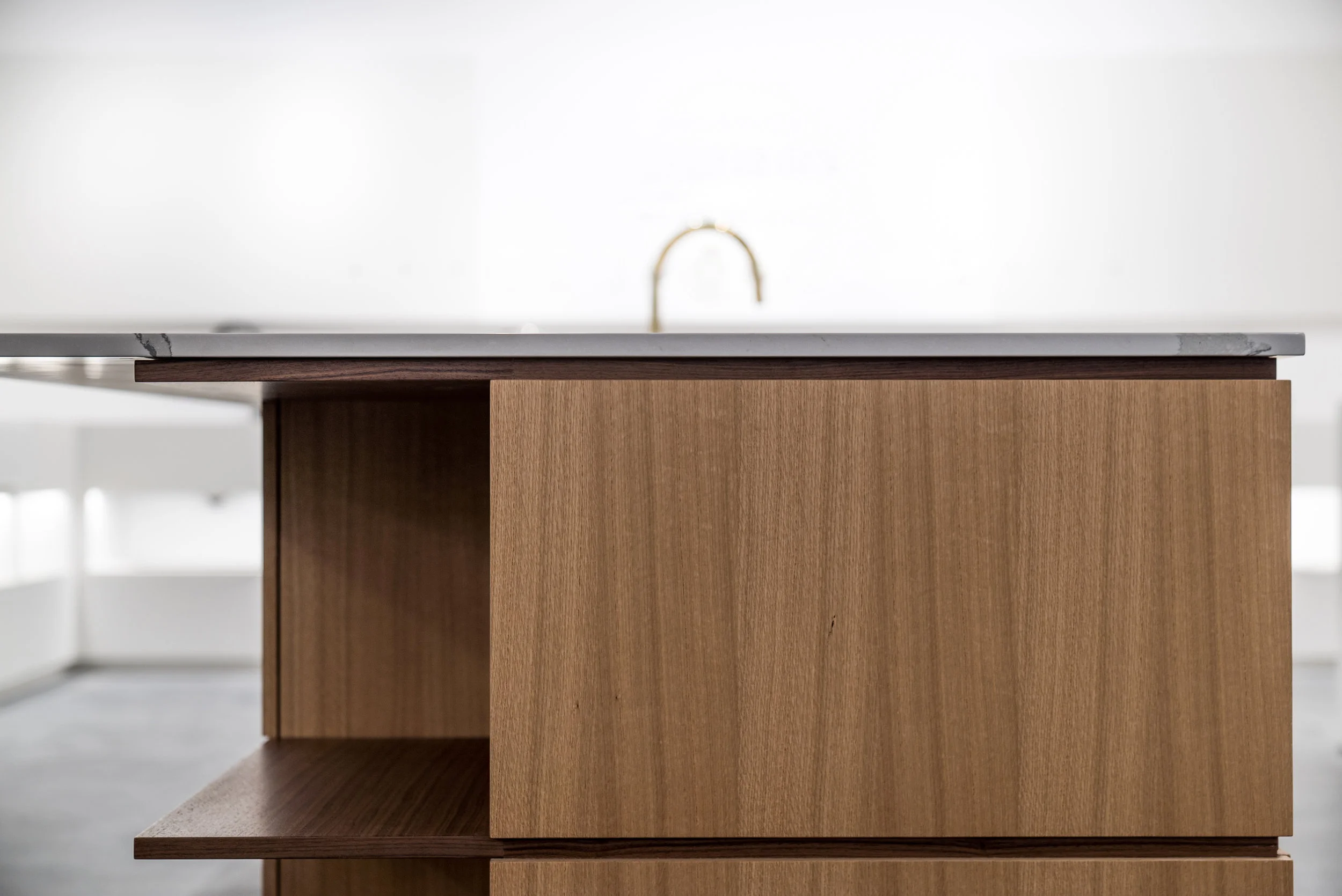
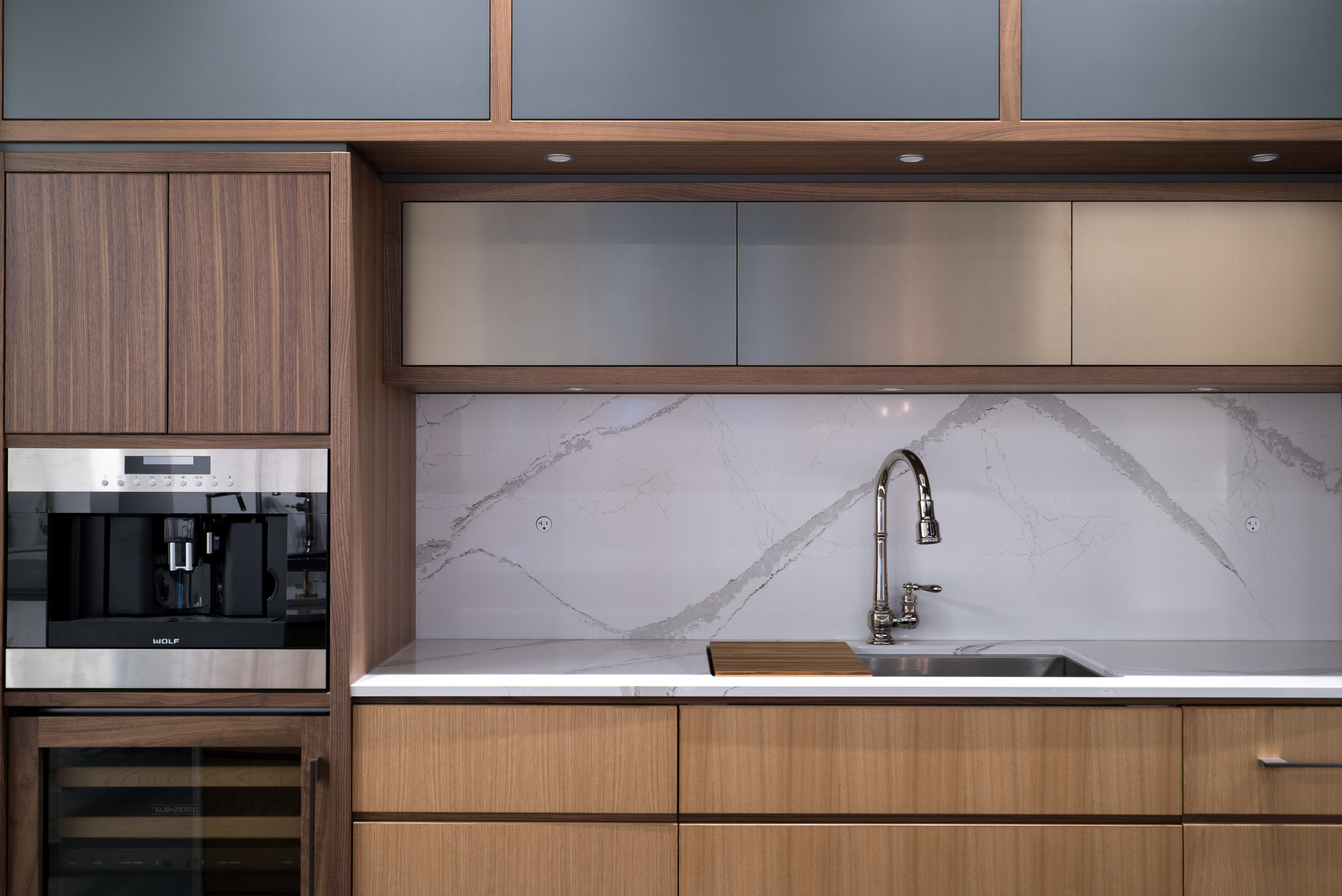
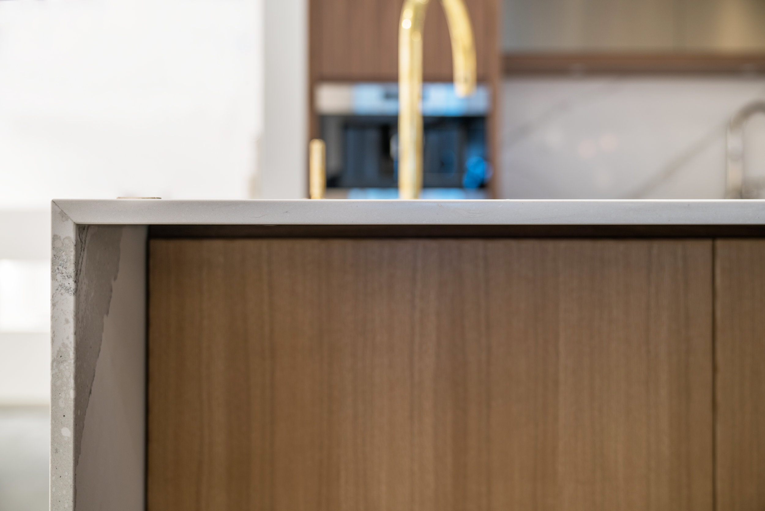
The Kohler Signature Store Vancouver is a sophisticated and clean space, featuring a mix of oak and walnut in the cabinets. The large Cambria Quartz backsplash adds a touch of luxury, with a unique splatter pattern that adds visual interest. The horizontal wood grain in the cabinets acts as a subtle design element that adds depth and texture. The hardware, appliances, and plumbing fixtures are a mix-and-match of different metals, adding a unique and modern touch.
The cabinetry is a mix of oak and walnut, with a simple and clean design that highlights the natural beauty of the wood. The large vibrant faux stone backsplash creates a focal point for the space, with a marble pattern for an element of surprise and interest. The horizontal wood grain in the cabinets provides a subtle design element that adds depth and texture. The mix-and-match of metal hardware, appliances, and plumbing fixtures adds a modern and sophisticated touch.
The use of oak and walnut in the cabinetry is a nod to classic kitchen design, while the marble backsplash and mix-and-match metal fixtures are more contemporary. The horizontal wood grain in the cabinets and mix-and-match metal hardware, appliances, and plumbing fixtures are unique design elements that add visual interest and modernity.
Overall, the Kohler Signature Store kitchen feature is a beautifully layered space that combines traditional and modern elements to create a sophisticated and simple design.
Build Team: Klondike Contracting
Millwork provided by The Banfield
Photographer: Josh Lasko Photography
Accolades:
Winner of Best Showroom 2019 - The National Kitchen and Bathroom Association
I explained to Jamie my ideas of what I thought would be a great kitchen in our space and he went with them. He didn't tell me that they wouldn't work or was to difficult like the other designers had. Instead he worked them into a fantastic kitchen design taking his experience he tweaked my ideas to create a very functional and good looking space. Jamie appeared to enjoy being creative and liked a challenge. I presented Jamie with a hood fan design from a magazine that starting this whole kitchen renovation, jamie thought it would look good in our space with a few adjustments he created an overall concept and design that was inspired by this hood fan. The other night I looked at the magazine again and I thought that Jamie's hood fan design was much nicer than the magazine! I can't believe how beautiful my kitchen is! It looks more than "beautiful" it looks "incredible" and magazine worthy.


