turtlehead ROAD, BELCARRA
NEW BUILD | FAMILY HOME | BELCARRA
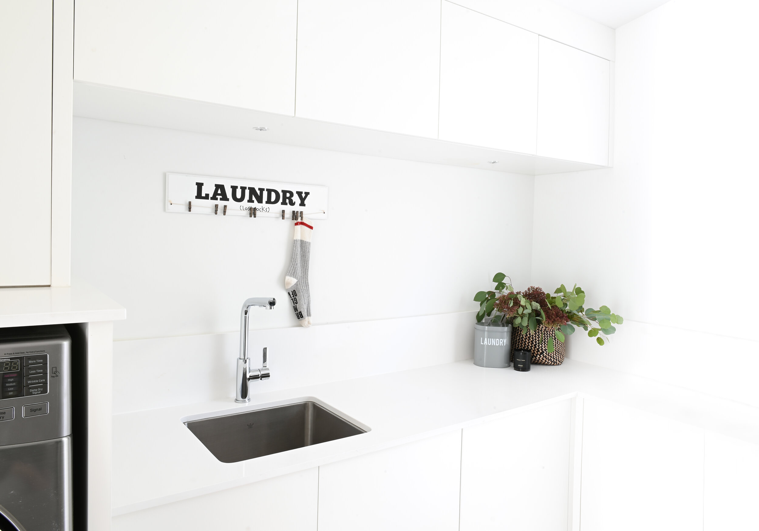
With a view like that, the house needed to be just as breathtaking. A contemporary West Coast-style home inspired by the surrounding coastline and greenbelt. With a variety of lifestyles and ages to account for and accommodate, it was important to create optimal storage throughout the home to keep the space clutter-free. Clever use of hideaways, tall storage, and custom millwork ensure that there would never be a problem with storage.
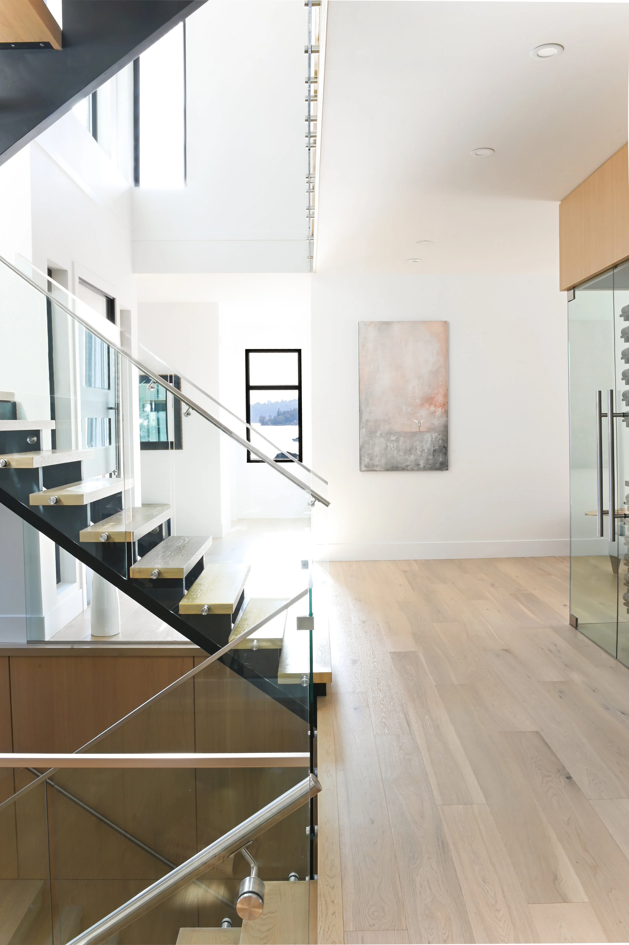
Clean rift cut out through the millwork not only does it keep the design consistent and light throughout the home, but it also evokes a beachy feature with its sandy colour and uniform grain. The stairway was fitted with glass to keep the eyeline uninhibited, and the chrome handrails give it a more industrial look. Through the use of reveals (i.e.: gaps in the wood panels), we made the design more interesting yet uniform and blended the hidden doors into the rest of the walls. The concealed doors lead to an entertainment space equipt with a pool table. The wine cellar acts as a feature yet it doesn’t detract from the rest of the design. It brings in the same finishes from the stairs so that you can see through it from all sides. with integrated wine pegs for a clean look so the racks wouldn’t overpower the bottle’s designs.
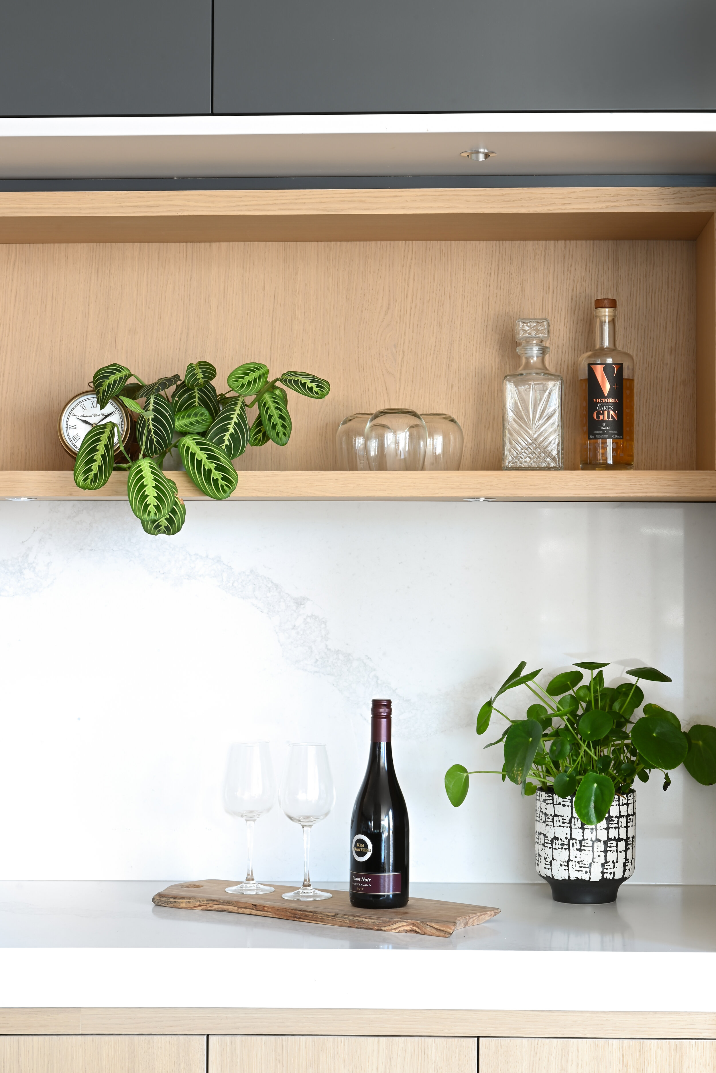
In the kitchen, the ceiling height was maximized while playing with scale and stacking linear contracting upper cabinetry to make the space feel wider not taller. Three different finishes are featured in the kitchen: we combined the white lacquered lower cabinets with the same white ash wood, but we utilized black as focal points. Touch latches maintain a smooth, clean look. The clean white countertops and backsplash keep the eye trained forward so you can admire the view from the horizontal windows. For the appliances, we went with stainless steel to play off the industrial lights and chrome plumbing. A butler’s pantry keeps the same design story with the same wood ladder and countertops but showcases an exposed beverage fridge and open shelves.
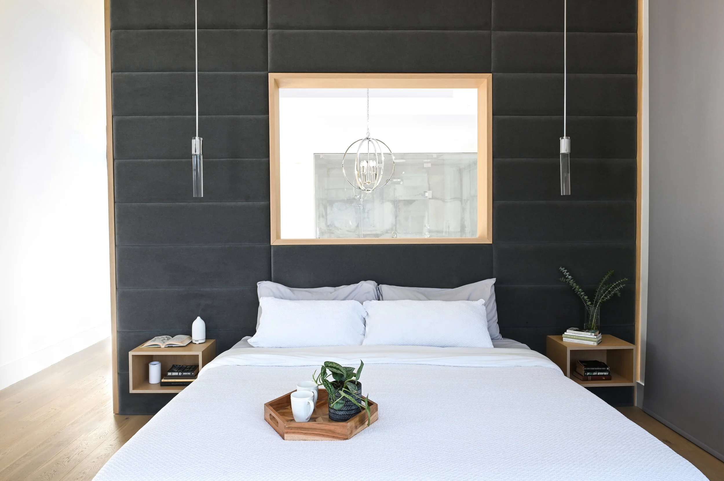
In the offices, TV room, and bedrooms, the same wood and white combo with custom millwork, floating desks, and bookcases. The principal bathroom sprawls uninterrupted into the spa-like bathroom. The free-standing tub with tub filler overlooks the bay view. The view is the centrepiece of this space so we designed the room around it with simpler, clean shapes and colours. The same reveals as seen in the stair design can be found in the vanity millwork. Duel vessel sinks, wall-mounted faucets, and a makeup station serve as the perfect place to get ready in the morning. The hotel-like principal bedroom was given a “window” over the bed that looks into the bathroom and keeps the light flowing through. The upholstered headboard with tufted details and flanked the bed with floating nightstands. A massive walk-in closet with an amazing view act as the cherry on top of this luxury home.
Photographer: Tracey Ayton Photography
Accolades:
Finalist for NKBA’s Large Contemporary Kitchen in 2019
Jamie and his team were professional at all times during a very difficult major rebuild of 5000 sq. feet. Jamie Banfield Design Inc. was unflappable and provided many insights that proved beneficial. The team worked well with contractors and never seemed to be in their way. Their patience was exemplary in insisting that I understood the process and recommendations. Being well-known gave me access that was also appreciated. Jamie and the team helped us with the design and finishing materials for our kitchen renovation. They were patient, creative and fun to work with too! While we had given the design a lot of thought before bringing Jamie in, he made suggestions that challenged our thinking and turned out to be absolutely perfect for our space.
